DESIGN DISTRICT

Location: Greenwich Peninsula, London, UK
Client: Knight Dragon
Consultants: Whitby Wood, Skelly & Couch, Artelia, Optimise

[ URBAN DESIGN / INFRASTRUCTURE / EDUCATION / COMMERCE ]
[ 1602 ]

The Design District is part of the Greenwich Peninsula Masterplan and is a vibrant cluster of 16 new buildings for the creative industries at the heart of Greenwich Peninsula. It is designed as a “piece of city”, with a distinctive street grain, architecture, and urban character. The district comprises 16 free-standing buildings composed around five courtyards. Creating 14,000 sqm of studio space for makers in the creative industries.


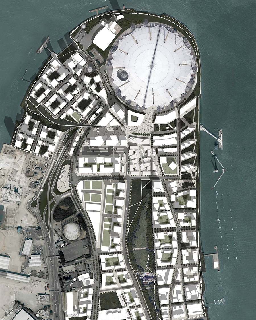
Having worked on the Greenwich Peninsula Masterplan with Allies and Morrison HNNA were then directly appointed to concentrate upon the area to the head of the central park and the heart of the peninsula which is known as the Design District.

© HNNA

© HNNA Ltd

The district comprises 16 free-standing buildings composed around five courtyards. Creating 14,000 sqm of studio space for makers in the creative industries. 

In the last half century artists and creatives have been used as a sacrificial catalyst to fuel the gentrification of undesirable, often post-industrial, areas. Once effective they are priced out and lost. The client’s ambition was to produce a permanent location for creative startups in the heart of the peninsula to ensure its distinction from other genericized, brand dominated pieces of city.

Structures here are low cost in order that tenant rents can be kept affordable - long term - preserving their permanent place in the centre of the peninsula not as a temporary installation or moment but rather as an important cultural component in the urban mix.

As you will see our other work our approach is to resolve the brief not with big architecture but instead create a permeable, accessible urban solution.

The most efficient approach would be to produce large, single, sealed industrial scale building with car parking. Particularly given the cost constraints.

© Knight Dragon Developments Ltd

© Knight Dragon Developments Ltd

But we determined to design a “piece of city” not “big architecture”, with a distinctive street grain, architecture, and urban character to create a environment for innovation.

In the wider context of many tall buildings on the Peninsula, the intimate scale of the Design District immediately announces it as a different kind of place. 

Pedestrianised, and comprised of a collection of three-five storey individual buildings, the Design District shares qualities with the scale and tight grain of pre-industrial inner-city neighbourhoods. The height, scale and massing of the buildings is small and human-scale in relation to the tall large footprint masses of surrounding buildings in the overall masterplan. 

As a plot layout, the scheme sets a strong, clear framework defining all the key spaces, edges, and movement routes.

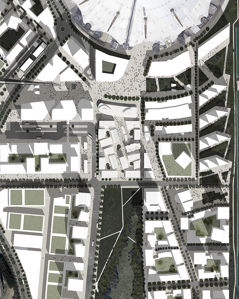
Despite it’s distinctive urban grain, the scheme meshes with the surrounding masterplan context. The alignment of Chandlers Avenue as it approaches Peninsula Square is one of the principal lines in the Peninsula Masterplan. This alignment is echoed in the primary routes of the Design District, and related sub-geometries pervade the remaining District layout. 

These geometries are also enlisted to disrupt otherwise straight axial routes through the District, breaking lines of sight, enhancing the immersive qualities of the Design District’s ‘interior’ courtyards. Entry points to these main routes are flared into open ‘mouths’, most notably to the Gateway Hub, drawing footfall from Peninsula Square to the District Square and thereafter Central Park.

The buildings are clustered in four groups of four, each cluster enclosing a coworking yard peculiar to its cluster, with a primary shared courtyard in the centre. 

The front of house District Square is given a more formal orthogonal geometry, establishing its authority. In contrast the back of house coworking yards are irregular and tighter, giving them an attractive informality and inviting interaction between buildings at ground level. All the courtyards are ‘hidden’, being only glimpsed from outside the District, inviting pedestrians to discover each in turn. 

All the courtyards are permeable and connect to each other, having routes in and out at every corner. The result provides a sense of spatial containment but not confinement.The proposal of setting a series of buildings and room-like spaces in a network of pedestrian-only lanes defines the urban approach. Unlike a shopping centre or business park, the Design District’s lanes and courtyards are pedestrian, external and shared. It does not have front doors which close, or a roof which contains. It's a place the public can flow through and interact with; a new urban fragment of the city of London. With all the advantages of freedom of movement that being car-free allows.

© Knight Dragon Developments Ltd

© Knight Dragon Developments Ltd

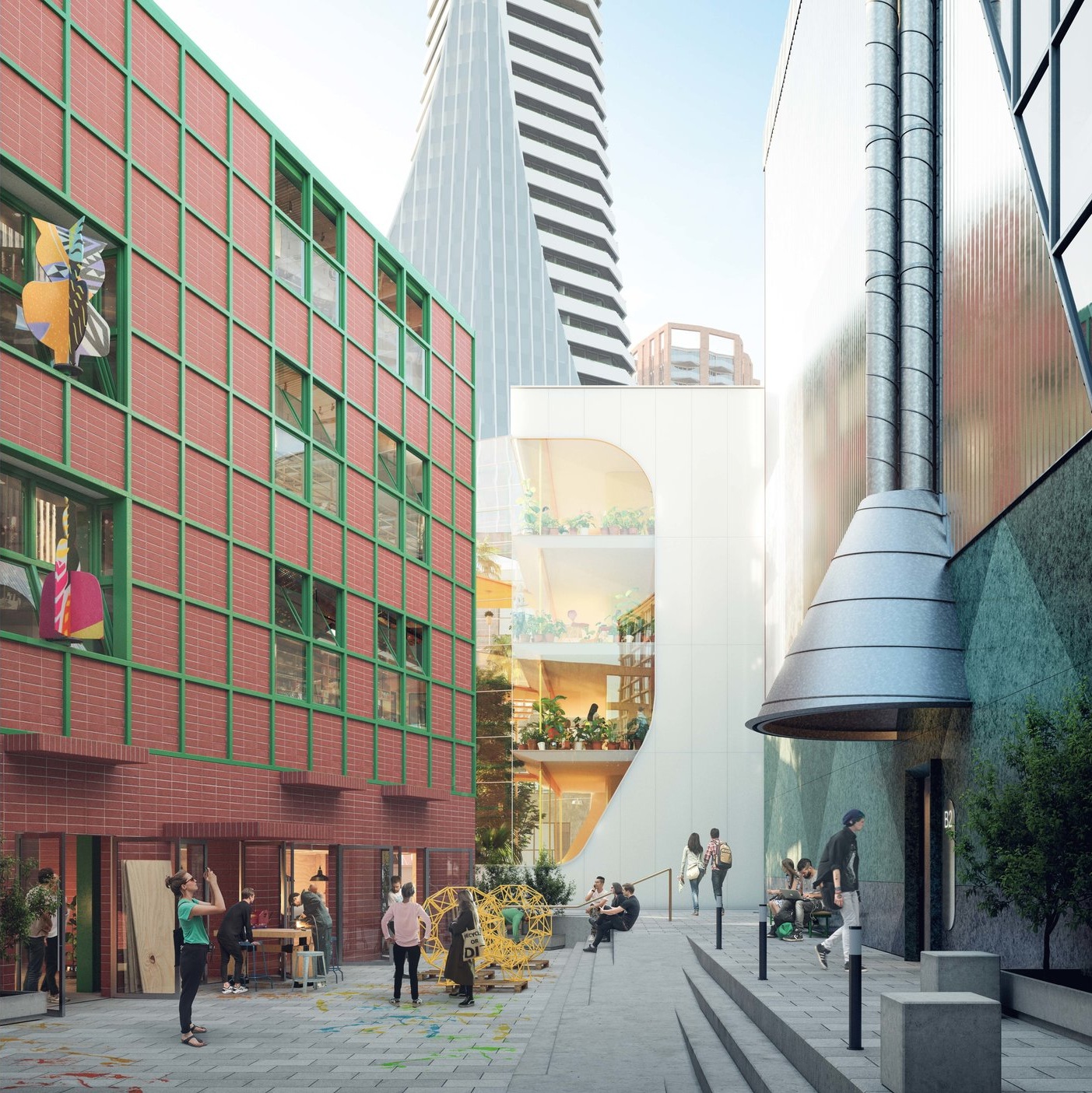
In addition to its urban, landscape and place-making qualities, the Design District is also an ambitious architectural project in its own right: As discussed the easy route would be a single large industrial building. The decision to split the accommodation into 16 separate buildings was further complicated by the decision to allocate the buildings to 8 different architects.

Our role sitting both sides of the table to oversee the masterplan, coordinate the architects and also be one of them was challenging. The selection of the architects was deliberately undertaken to give a mixed voice. 

The phrase “Marmite building” was invented and accepted by the client to describe the reality that the different offer of buildings allowed for a range of varied tastes.

© Knight Dragon Developments Ltd

© Knight Dragon Developments Ltd

At the same time, the physical detachment of each building permits its own distinct architectural language or ‘voice’ particular to that architect. It allows the architect to compose the building form and all external elevations as a coherent sculptural object. This sense of each building achieving a discrete identity is made more complex with each architect designing a pair of buildings. 

The pairs are deliberately not adjacent to each other, promoting ‘family’ relationships across the District. The continuity yet diversification of the buildings is deliberate and strategic. Variation and individualisation of building character is encouraged and supported, in a frame. The approach leverages the logic of the contemporary city: heterogeneity of feel, variety of offer, architectural pluralism, and yet cohesiveness in the whole.

We deliberately didn’t set the usual design codes that are typical of masterplans. As part of our urban design, regulatory and economic constraints were well understood.

  • Budgets were allocated relative to lettable area

  • In order that the public spaces in the district stay cohesive and the hierarchy of streets remain legible building footprints had to be maintained.

  • In order that the spaces be affordable for the appropriate users construction costs had to be kept low. 

  • The buildings were allowed play in section as the area required wasn't a maximisation of the footprint extruded to the height constraints.

© Knight Dragon Developments Ltd

© Knight Dragon Developments Ltd

We also didn’t superimpose a materials palette as we knew that the facade would be a significant proportion of the budget and we were keen architects innovate around the necessary tight cost constraints.

The process of design and architectural evolution of the individual buildings followed a dual path. 

Architects balanced bursts of work in isolation with mutual comparison and response over successive iterations of their designs. 

The process of explanation and approval operated very like that of the university crit allowing co-ordination between buildings by mutated association. 

This offered flexibility to the designs and avoided compromise.

As urban designers we saw our role to liberate and enable the creativity of the architect but that wouldn’t have worked without a clear platform.

© Knight Dragon Developments Ltd

© Knight Dragon Developments Ltd

HNNA are the masterplanners and design coordinators for the Design District as well as being 1 of the 8 architects.

“The two HNNA buildings are distinct cousins. Their clean, white aesthetic is interrupted by the informality and transparency of their skin, shaping unexpected ways to enjoy interstitial spaces and soften boundaries. Undulations operate horizontally and vertically in the different buildings. They shape the angle and depth of view from the irregular or oversized apertures onto the narrow lanes or expansive park. Both are designed to be well-loved and animated via occupation and light.” HNNA

© HNNA

© HNNA

Building C3 fronts the main square of the Design District as well as the District’s eastern edge to Phoenix Avenue. It also sits beside the market building, helping enclose the market courtyard to the north. A double-height bar/restaurant is placed at the ground level of the building, addressing the square. The bar/restaurant seating spills into the square, where direct sunlight is available at lunch times.

The building positions it’s core in the centre of the plan, minimising circulation and maximising daylit space at the perimeter. A single top-lit general stair doubles as an escape stair. Entry to the rentable space from the core is available in two directions. An undulating facade of vertical white battens wraps the exterior of the building. The undulation works to break down the building mass from the outside and create informal pools of space on the inside. Windows in the undulating facade line face different directions, like bay windows.

The top floor is characterised by its inward falling hip roof, made of resin-faced plywood. The hipped roof resolves in two small courtyards for users at the top floor. The exposed ribs of the roof structure are visible from the public realm, hinting at the spaces within. An irregular eave line is created by the undulating facade meeting the straight pitched roof.

Building D3 is positioned on the eastern corner of the Design District facing Central Park. The building design is that of a protected box sitting within an outer skin that acts as both solar shading and balustrade at first and third floor levels. The design plays with scale by greatly over-sizing the uninterrupted window openings that are positioned across floors. These also allow unparalleled views of the park.

The simplicity of the layout and form is softened by the semi-transparent, horizontally rippled, white perforated metal outer skin. This outer layer gives the building an ephemeral appearance with the depth and shadows of the balconies and box within being visible. The doors to all façades are also repetitive and over-scaled, sitting behind the outer skin to allow natural cooling of the building during day and night. These doors also allow access to the first floor balconies on the southern façades which means that the activity around the building at ground level is replicated across the façade.

The building’s core and main entry point face onto the shared working courtyard to the north. The movement within the feature stair is clearly visible from this shared space and in turn from the main square. The stairwell is both top and side lit to maximise daylighting and is used to access the roof terrace. The rooftop is expressed as a platform on which a series of rooftop objects are placed. Core elements become sculptural at this level and additional temporary objects are possible, some functional, some sculptural. At ground level the large glazed openings to all façades offer views through the building further increasing the building’s lightweight, transparent feel.

© HNNA

© HNNA

© Knight Dragon Developments Ltd

© Knight Dragon Developments Ltd

We have used clear and translucent materials to create light, transparent buildings. The market hall is a caterpillar-shaped metal structure that shines at night to become a focal point for the neighbourhood. Stalls on the ground floor serve food from around the world, while people eat upstairs in amongst the treetops. The second building of the pair has a winter garden, so people can enter their working space through the calm of the foliage.SELGAS CANO.

The market building C4 welcomes locals and visitors thanks to its privileged location; just right at the main pedestrian access to the Greenwich Peninsula. The market celebrates its visible condition by being as transparent as possible. A very light metal structure and a stressed clear ETFE membrane cover a central spine in which we place the stalls and a seating area on top. This spine is the market itself. The stalls display at each side of the spine at ground level while a seating area is provided just above it and under the tree canopies. The whole spine is built with translucent backlit materials acting as a big lamp that illuminates the market and the ETFE membrane, making the whole market shines at nights and become a focus point in the neighbourhood. The market has its main access doors at both extremes of it but it is also accessible at the sides. These operable panels at base level are built with polycarbonate instead to avoid any possible vandalism. The ETFE membrane is subdivided in different panels which some of them are operable for ventilation reasons and to provide the wonderful feeling of being in a street market.

© Knight Dragon Developments Ltd

© Knight Dragon Developments Ltd

© Selgas Cano

© Selgas Cano

The building B1 sits in a very particular plot as it faces the main public square to the north and a heavy traffic road to the south. As a response, the building splits in two creating two different volumes: the office and the winter garden volumes. The office volume looks at the main square while the garden volume sits at the rear of the offices creating a barrier that keeps the offices away from the sun and the traffic sound. The retail located at ground level will increase the sense of public space to the main square while the office access is located within the winter garden in a more private and personal entrance. Generous stairs and platforms accompany the way to each office level trough a rich a peaceful garden...

The volume itself is as concentrated as possible to minimize the shadows on the main square and it is finished with clear and translucent materials to get the feeling of a light and transparent building.

© Knight Dragon Developments Ltd

© Knight Dragon Developments Ltd

Our buildings are a pair of un-identical twins, with the similarities and contrasting differences of siblings. The pair are inspired by American artist Richard Artschwager’s work in Formica.

Rectangular boxes are cut steeply to open up the views within the Design District. Deep warehouse-like halls on lower levels lead to tall, narrow studio spaces higher up. The coloured blockwork on the concrete frame gives way to a pop collage of huge diamond windows.” 6a ARCHITECTS

Situated at either end of the design district’s main square, A2 and B2 sit as a pair of nearly identical buildings containing a set of working spaces, retail and F&B across 4 floors. The north facing façade of each building is raked bringing north light into the interiors, whilst opening up the public spaces of the district to the sky. The sloped façade has glazed and coloured solid areas in a harlequin pattern, A2 in reddish pink and B2 in a pine green. The colour and pattern of the sloped façade is continued at ground floor in hard wearing granite. The other facades are wrapped in corrugated metal, reflecting daylight into the alleys and courtyards.

A large diamond window in the end facade of A2 gives views on to the main square and a glimpse into the interiors of the workspaces, whilst a smaller opening in B2 orientates views across the park. To each courtyard a four storey window cuts across core and office space alike, revealing the movement of people up the stairs. In each building the compact core containing the stair, lift, risers and WCs is pushed to the southern edge, allowing a large uninterrupted space for working along the north sloped facade. The main entrance to the work spaces on the upper floors is from the working yards, whilst shower and lockers located off the entrance hall at ground floor level serve those who travel by bike.

The ground floor is split into two units with ground floor accessed from the yards and from the main square. The upper floors are arranged as open plan offices, with the potential to subdivide later on. An incoming services room on the ground floor allows for the easy repair and replacement of primary plant, and an external plant space located out of sight below the roof level allows for future adaptation of the mechanical services. The small area of roofs, an important elevation visible from the surrounding taller buildings, are patterned and coloured.

© 6a Architects

© 6a Architects

© 6a Architects

© 6a Architects

The buildings offer generous ceiling heights and the double height studio on the third floor forms a space of spectacular vertical proportion filled with light. The exposed concrete frame gives a robust character to the interiors, and its thermal mass helps to regulate the heating and cooling of the building with natural opening vents working in conjunction with a mechanical heat recovery system. The concrete upstand formed at the leading edge of the floor plate creates a wide work surface closest to the daylight and fresh air. The infrastructure of the building is very much part of its character and expression, from the oversized rainwater gutter and downpipe at the foot of the sloping facade, to the ventilation ducts which gather in a metal canopy above the front door to mark the main entrance. The resolution of the façades and the technical requirements of the buildings are synthesised into a composition of vents, ducts, rain water goods, copings as well as openings, to give these necessary working components a presence to signify the design district as a place for people and their work.

© Knight Dragon Developments Ltd

© Knight Dragon Developments Ltd

ESTUDIO-BAROZZI-VEIGA.png

“The reflection of light on the polished aluminium finish of these buildings changes throughout the day and looks different in every season. All year round, they give a luminosity to the surrounding courtyards and alleys. With large windows, external staircases and raised ceilings on the top floor, these buildings are designed with photographers, artists and sculptors in mind.BAROZZI VEIGA

Given a privileged location within the Design District, both A1 and D4 buildings have been conceived following the same strategy, though consciously adapting themselves to the specificities of each plot. A1 building marks the main access to the Design District from the Gateway Pavilions; it shapes an entrance square in front of the market and culminates the flow coming from the future bus station. D4 building instead, overlooks the central square with its tall and slim facade, becoming a landmark within the whole masterplan.

High and compact volumes have been achieved through the plinth and the exterior public staircase. This element establishes a relationship between the buildings and their courtyard, as well as divides the accesses to the different uses. The main access to the upper floors workspaces is located under the staircase. Both 4-storey buildings host commercial uses and working spaces. The building’s main features are their well-proportioned and comfortable interior spaces, with an average floor height of 3.75m. The top floor’s height has been increased up to 5m in order to host singular uses such as artists, photographers, painters, sculptors, etc.

The general layout is organised around a central compact service core, slightly displaced towards the courtyard, enabling a flexible distribution of the working areas. The position of the interior columns and the large windows provides natural light and views to the workspaces. Glazed parts are made out of a modular thin steel frame with horizontal pivot-axis windows, evoking the old industrial buildings. A continuous textile curtain runs along the interior of the facade, enabling each user to control and adjust the atmosphere to their specific needs.

The facade is made of galvanised steel, a material greatly used in the industry due to its resistance towards hard climate conditions and also its long term durability. Its brightness reflects the surroundings and gives luminosity to the adjacent alleys and courtyards. Each building will be finished with a slightly different texture/coating, establishing a dialogue along the Design District.

© Knight Dragon Developments Ltd

© Knight Dragon Developments Ltd

Sociability and openness is at the heart of Architecture 00’s designs. The roof of one building is a basketball court and pop-up bar and event space. Inside, floor to ceiling glazing and open, flexible-use space encourage adaptation to meet the changing needs of its inhabitants.

External space is as important as internal space. The upper floors and roof are reached by Escher-like interlocking sets of stairs on the outside of the buildings, open to the elements, and with public access at all times.” ARCHITECTURE 00

Building C1 is located near Peninsula Square adjacent to The O2 as well as the anticipated highly trafficked area of the market (Building C4). The building addresses both these highly public activities by forming an inviting gateway to the food court’s external square via a large cantilevered concrete slab. A large publicly accessible staircase invites the public to ascend the building allowing the workshops, studios and office spaces to engage the public at each level. The top of this vertical landscape provides a basketball court set within a continuous stainless steel wire rope mesh enclosure.

The robust, thick concrete slabs sandwich full height glazed curtain walling between them, forming the shop fronts to the units. The floorplates have been designed to be sub divisible, thereby allowing a variety of tenants.

© Knight Dragon Developments Ltd

© Knight Dragon Developments Ltd

© Knight Dragon Developments Ltd

© Knight Dragon Developments Ltd

Building D1 provides a community of adaptable studios, workshops and office spaces within a secure vertical landscape. Concrete external covered decks provide access, creative thresholds, and social spaces for tenants as well as allowing the tenants to expand beyond their units to work on larger scale projects. The continuous stainless steel wire rope mesh provides full balustrade edge protection to these decks whilst also retaining a very clear visual connection between the public and the workshops. The varying floor to ceiling heights in the building, combined with the varying footprint of each floor encourages variation in usage.

The building consists of robust, thick hardwearing concrete slabs with clear, full height glazed curtain walling sandwiched between them. Trees are located generously on the external decks. This robust and adaptable nature creates a communal and permissive environment to encourage creativity.

© Knight Dragon Developments Ltd

© Knight Dragon Developments Ltd

This pair of buildings act as a pair of mini glowing palazzi. One building features a large illuminated roof-mounted sign, inspired by the writings of Robert Venturi on middle American urbanism and the famous Hollywood sign. The other half of the pair has a roof terrace and balcony looking onto Central Park. Every year, six new sculptures will be commissioned to occupy niches on the rear of the building. Made from red bricks and glass blocks, inspired by Pierre Chareau’s Maison de Verre in Paris, both buildings are surrounded by green metal grids – in reference to British architect James Stirling. Classical use of symmetry and composition is offset with twists throughout with materials and colours; engaging with rules but wanting to break them.” DAVID KOHN ARCHITECTS

Building A4 is located on the western edge of the Design District where it fronts on to the new bus station. The design of the four storey building is primarily driven by a response to this location. A large illuminated roof-mounted sign announces the Design District to travellers while a bold red brick carpet and colonnade present an inviting face to the site. The two ground floor units have front and back curtain glazing that allow views through to the courtyard beyond. The three floors of studio spaces above are wrapped with a skin of glass blocks, red brick and windows held in a green metal frame that give the building an ambiguous scale. The front corners of the building are chamfered and celebrated with sculptures that reflect the use of the building and district as creative spaces. The rear façade of the building is animated by niches that allow the occupiers to display their work publicly, revealing the life of the building to the rest of the design district community. Building A4 forms a pair with building B4, sharing the same composition and materials but responding to their contexts in different ways.

Building B4 forms part of the south-west corner of the Design District, and overlooks the park. Like A4, the design of the building has been driven by a response to its context. As both A4 and B4 have their long elevations to the bus route, they have been given consistent elevational treatments, plinth and parapet heights to establish a street frontage. In other ways, B4 is the opposite of A4: The entrance is from the courtyard side of the building; the ground floor units are more closed to the street and open to the courtyard, intended for maker processes to spill outdoors; and B4 has a roof terrace and balcony to address the park. Like A4, the central three floors of studio spaces are wrapped with a skin of glass blocks, red brick and windows held in a green metal frame. The front corners of the building are chamfered with sculptures while the rear façade is again animated by niches to display work, revealing the life of the building to the rest of the design district community.

© Knight Dragon Developments Ltd

© Knight Dragon Developments Ltd

Inside, these buildings emit warmth and character with their exposed beams and wooden ceilings. Outside, they have their own identities: one compact with changing colours like a burning gas flame, the other stacked like a ziggurat. Inspired by an old photograph of male and female forms. Both buildings are clad in metal: one in a striking CorTen weathered steel, the other with an iridescent painted finish that changes colour with the light. Yet these buildings tread lightly. Timber is chosen for its renewable low carbon properties. External shutters keep each building cool in summer, and top-lit studio spaces capture natural light.MOLE ARCHITECTS

The main entry to the building is off the internal square, which will be a gathering place opposite the market building. The stairs, lifts and toilets are located on the north side , allowing the windows to the internal spaces to overlook the street on one side and the courtyard on the other. The glazing to the ground floor has a solid panel down to the ground from the cill, although this could change in the future to allow for direct access from the courtyard.

The building is designed to be hard to the pavement on the east side, three stories with a ‘butterfly’ roof. Constructed out of solid timber (CLT), the solid timber floor slabs are exposed on the soffit, with a raised floor distributing services. The distribution of windows and shallow depth of the section ensures high levels of daylight and the ability to naturally ventilate the floors. The top floor has a sloping butterfly roof with triangular rooflights at the top corners, animating the internal spaces.

The building is clad in a continuous rainscreen of profiled steel sheets, painted in a metallic golden bronze finish. Large windows are positioned to make the most of the views and are located so that internally, the distribution of daylight remains similar to each floor of the building. The windows are glazed with a reflective coating, which will change depending on the angle at which they viewed. The combination of the shadows falling on the profiled façade and the reflective glass will animate the building. The colours have been inspired by the colours of a gas flame, the site having been the largest European producer of natural gas. On the west side are external shutters, and on the east side are fins that shield the upper floor windows from solar gain.

The main entry to the building is off the internal square, which will be a gathering place opposite the market building. The stairs, lifts and toilets are located on the north side , allowing the windows to the internal spaces to overlook the street on one side and the courtyard on the other. The glazing to the ground floor has a solid panel down to the ground from the cill, although this could change in the future to allow for direct access from the courtyard. The building is designed around a timber frame with exposed columns internally.

The building is designed around exposed timber frame, with a stepped façade. Each level steps back by around 200mm creating a ‘ziggurat’ profile, with successive floors becoming smaller. Internally the solid timber floor slabs are exposed on the soffit, with a raised floor distributing services. The distribution of windows and shallow depth of the section ensures high levels of daylight and the ability to naturally ventilate the floors. The top floor has a series of north facing roof windows in a sawtooth roof which ensures a bright top floor with no direct sunlight.

The building is clad in a continuous rainscreen of flat Corten steel arranged diagonally on the façade. The 200mm stepback at each floor gives the building its distinctive ziggurat profile, and the windows are arranged in strips at each of the setbacks, with decreasing widths as the building decreases in size. This responds to diminishing need for daylight at the higher floors. The whole building is reminiscent of Victorian gas holders, and is has an industrial quality that recalls the origins of the site as the largest producer of gas in Europe. On the west side are external shutters, and on the east side are fins that shield the upper floor windows from solar gain.

© Knight Dragon Developments Ltd

© Knight Dragon Developments Ltd

A celebration of roughness and ragged edges, of the bits that others choose to cover up. Inspired by the construction sites elsewhere on the Peninsula, the architects explore the raw beauty of semi-complete forms. These striking exteriors contrast powerfully with comfortable interiors designed to inspire calm and contemplation.” ADAM KHAN ARCHITECTS

The ground floor level provides an internal north-south connection between courtyard and street, along with two independent entrances. The compact core allows for the area to be used in shaping generous stairs and lift lobbies. The core location also allows for the workspaces to enjoy the best light conditions and views. The north facing kitchen may be the space which connects east and west workspaces, making them one single unit at every level or, the shared space between two independent tenants.

The ground floor clear height is set at 4m to allow light to penetrate deep into the plan. At first floor, a double height space improves internal daylight quality and enhances the relationship between internal spaces and main square.

On B3 the hierarchy of spaces is inverted, the last floor becomes the tallest and takes advantage of views towards the park. The elevations are composed with large precast concrete elements in a similar fashion to a game of Jenga . The stacking of elements challenges ideas of balance, and words such as raw, precarious and vulnerable come to mind as if one piece of the ‘game’ was to be removed, the whole building would collapse. Elements take a different finish and detach from the glazing to mark exceptional moments such as the double height space facing the main square on building A3.

The precast concrete elements will be of a dark geological colour. Additional character and texture will be given by manipulating formwork. The concrete finish will be further developed through intensive research and testing of samples and mock-ups, with the clients and precast contractors integral to this process, allowing the character of the buildings to take on personality in an organic and natural way.


© Socio Design

© Socio Design

Creative Review - 29 SEPTEMBER, 2017

Creative Review - 29 SEPTEMBER, 2017

© Knight Dragon Developments Ltd
Dezeen - 28 SEPTEMBER, 2017

Dezeen - 28 SEPTEMBER, 2017

The Architects’s Journal - 28 SEPTEMBER, 2017

The Architects’s Journal - 28 SEPTEMBER, 2017